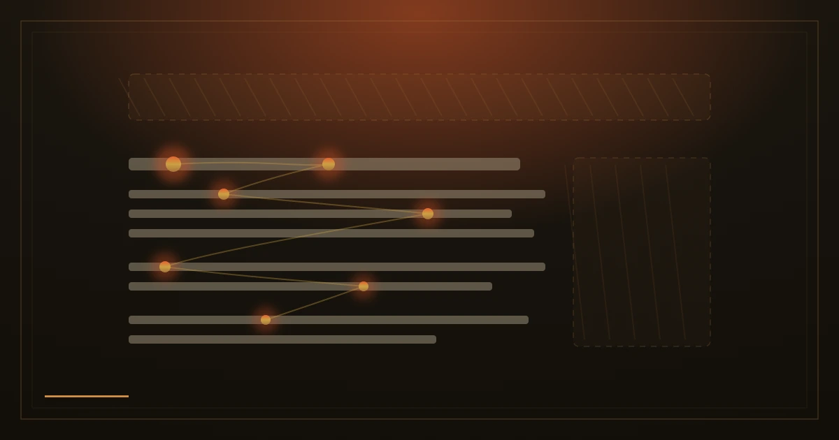
In 1998, two researchers at Rice University, Jan Panero Benway and David Lane, watched people hunt for information on web pages and noticed something odd. When the answer sat inside a large, colourful, banner shaped box, people kept failing to find it, even though it was the biggest thing on the screen and exactly what they had come for. The pair gave the pattern a name that stuck: banner blindness.
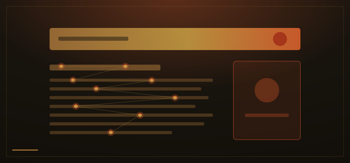
It is not carelessness. It is a skill. Years of browsing have taught every visitor that bright boxes, tilted badges and anything standing apart from the main text are usually advertisements, so the mind filters them out before reading even begins. The Nielsen Norman Group has confirmed this with eyetracking studies across two decades: recordings of where people actually look show attention landing on the plain content and leaving blank holes exactly where the ad shaped elements sit. People skip real content too, whenever it merely resembles an ad.
Here is the expensive part: the filter judges by appearance, not by what the box says. It cannot know that your delivery promise, your opening hours or your genuine discount is not an advert. Dress an important fact like a promotion, with a loud background, a border and a shout of colour, and it inherits the invisibility. Benway and Lane's participants missed the very answer they were asked to find because it sat inside something that looked like a banner.

Position does the same quiet damage. Readers arrive for the main column of a page and stay in it. Whatever is placed beside that column, in a side strip or along the top edge, starts every visit with a handicap, and a bright graphic there that has nothing to do with the text around it is close to guaranteed to be ignored. The places businesses most like to put their special announcements are precisely the places eyes have learned to avoid.
What passes the filter is unglamorous: plain content in the normal reading flow. A key fact written as an ordinary sentence, in the same type as everything around it, gets read. A customer's words presented as part of the page's story get read. A price, a guarantee or an offer laid out like content, with the same calm styling as the rest, gets read. The eye trusts whatever looks like the thing it came for.

This runs against instinct. When something matters, the natural urge is to make it pop: brighter colour, a box around it, a badge in the corner. Banner blindness turns that urge on its head. The more decoration a message wears, the more it resembles an advertisement, and the harder the visitor's filter works against it. On the web, dressing information up is often the fastest way to hide it.
How we apply this: on the sites we build, nothing important is ever dressed as a promo. Prices, promises, proof and offers live inside the reading flow, styled as content, in the column people actually read. When we do use a promotional element, it carries only what a visitor can afford to miss, because we assume, correctly, that most of them will.