Journal
Journal: notes from the forge
Notes from the forge: on speed, restraint, and building for the person on the other side of the screen.
-
 Your visitors learned the web somewhere else
Jakob's Law: people spend most of their time on other websites, so they expect yours to work the same way. Keep the structure familiar and let the character stand out.
Your visitors learned the web somewhere else
Jakob's Law: people spend most of their time on other websites, so they expect yours to work the same way. Keep the structure familiar and let the character stand out.
-
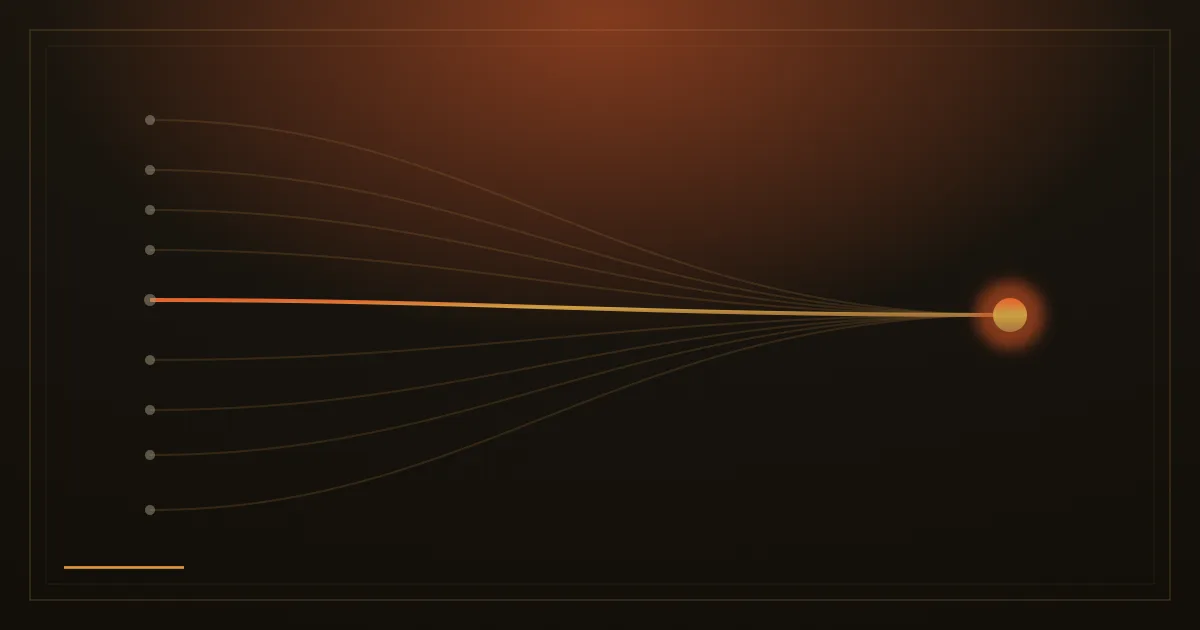 Why More Navigation Options Make Decisions Harder
Hick's Law and decades of choice research show that every extra option slows the decision, and the science is more nuanced than most realise.
Why More Navigation Options Make Decisions Harder
Hick's Law and decades of choice research show that every extra option slows the decision, and the science is more nuanced than most realise.
-
 If it looks like an ad, nobody sees it
Banner blindness: visitors have learned to skip anything that looks like an advertisement, even when it holds exactly what they came for. Why important facts must look like content.
If it looks like an ad, nobody sees it
Banner blindness: visitors have learned to skip anything that looks like an advertisement, even when it holds exactly what they came for. Why important facts must look like content.
-
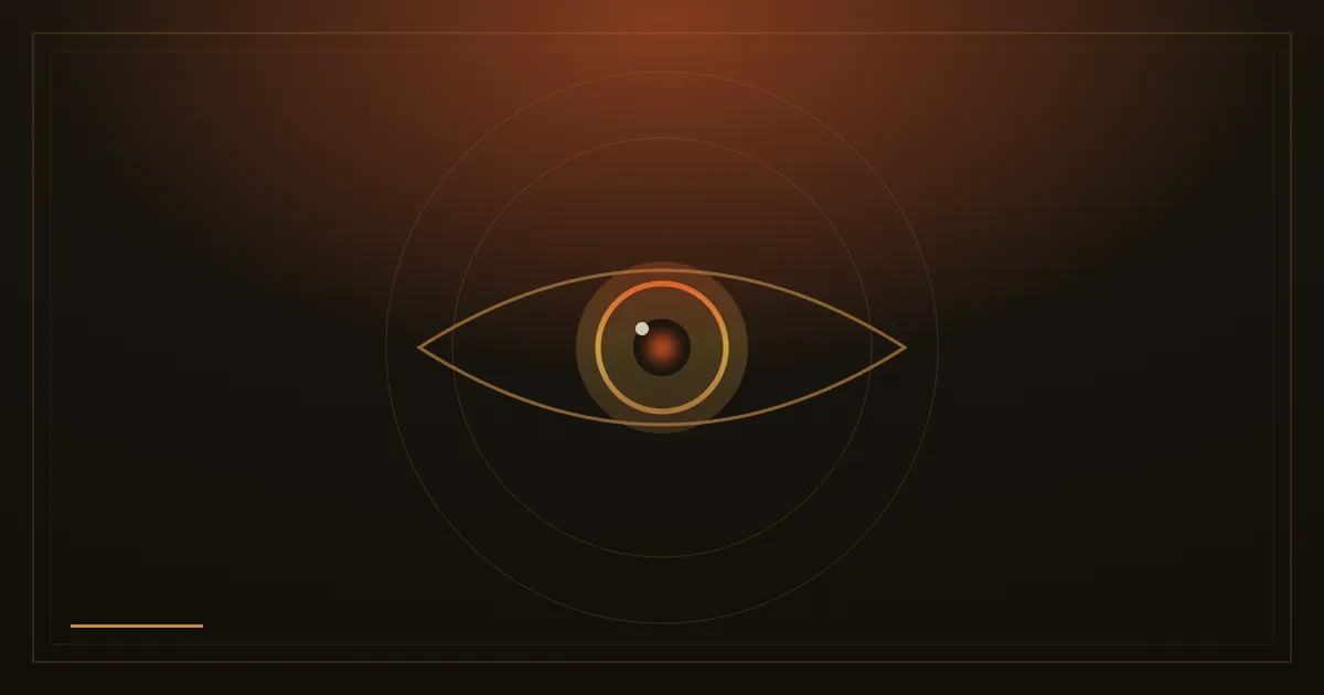 Where the Eye Lands and How Design Steers It
Eye-tracking research reveals how visitors scan a page, and how contrast, size, and whitespace can steer the gaze to your message.
Where the Eye Lands and How Design Steers It
Eye-tracking research reveals how visitors scan a page, and how contrast, size, and whitespace can steer the gaze to your message.
-
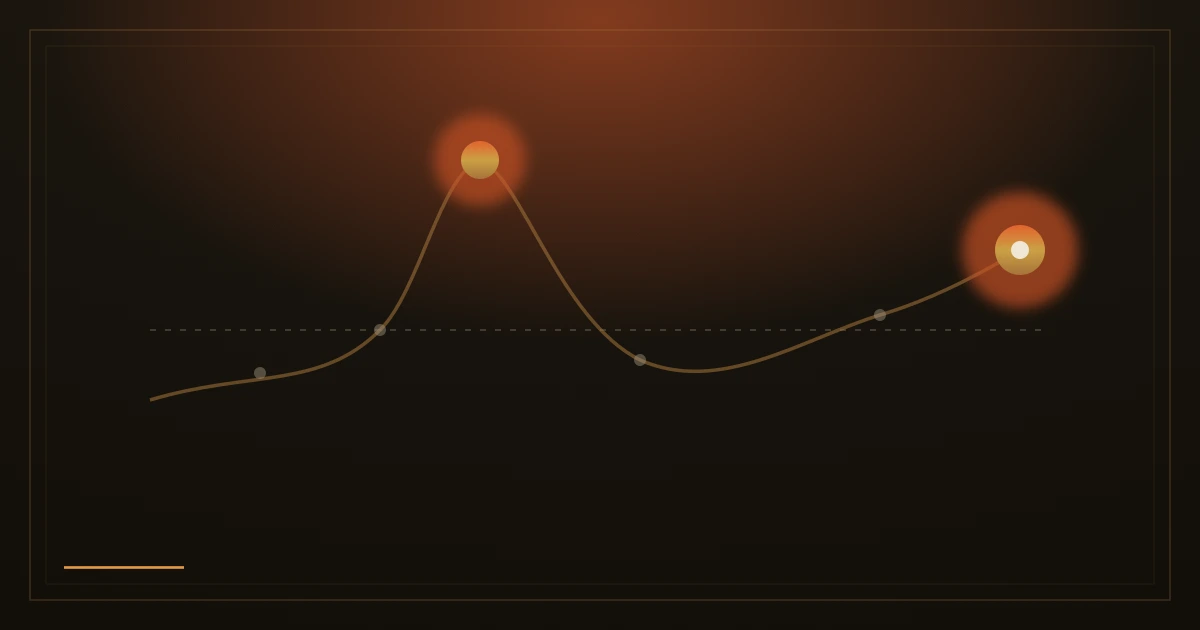 The ending is what they remember
The peak-end rule: people judge an experience by its most intense moment and by how it ends, not by its average. Why the thank-you page and the error message decide how your site is remembered.
The ending is what they remember
The peak-end rule: people judge an experience by its most intense moment and by how it ends, not by its average. Why the thank-you page and the error message decide how your site is remembered.
-
 When everything shouts, nothing is heard
The isolation effect: people notice and remember the one thing that is different. Why a page should have a single, obvious action.
When everything shouts, nothing is heard
The isolation effect: people notice and remember the one thing that is different. Why a page should have a single, obvious action.
-
 Forms that forgive
Don Norman showed that human error is usually a design problem. How a form that asks less, accepts human input and explains its errors turns visitors into customers.
Forms that forgive
Don Norman showed that human error is usually a design problem. How a form that asks less, accepts human input and explains its errors turns visitors into customers.
-
 Speed Is a Feature: What Load Time Actually Costs
Real research from Google and Deloitte shows the direct link between page speed and whether visitors stay, browse, and buy.
Speed Is a Feature: What Load Time Actually Costs
Real research from Google and Deloitte shows the direct link between page speed and whether visitors stay, browse, and buy.
-
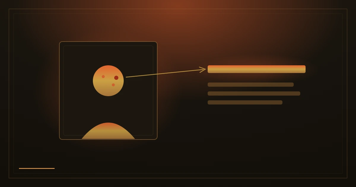 One real photograph beats a page of claims
Pictures are remembered far better than words, and nothing pulls the eye like a human face. Why one honest photo of your shop persuades more than paragraphs of promises.
One real photograph beats a page of claims
Pictures are remembered far better than words, and nothing pulls the eye like a human face. Why one honest photo of your shop persuades more than paragraphs of promises.
-
 People Scroll, But Only If You Earn It
Users don't ignore content below the fold, but eye-tracking data shows attention concentrates near the top. Here's what that means for your homepage.
People Scroll, But Only If You Earn It
Users don't ignore content below the fold, but eye-tracking data shows attention concentrates near the top. Here's what that means for your homepage.
-
 The first number wins
Anchoring: the first number a person sees becomes the yardstick for everything after it. Why the order and context of your prices matter as much as the prices themselves.
The first number wins
Anchoring: the first number a person sees becomes the yardstick for everything after it. Why the order and context of your prices matter as much as the prices themselves.
-
 Fitts's Law: Why Button Size Is Never Arbitrary
The 70-year-old formula that explains why some buttons feel effortless to tap and others keep making you miss.
Fitts's Law: Why Button Size Is Never Arbitrary
The 70-year-old formula that explains why some buttons feel effortless to tap and others keep making you miss.
-
 The closer the finish, the faster we run
The goal gradient effect: people push harder the closer the end feels, and a head start makes them far likelier to complete. Why a form should show its steps.
The closer the finish, the faster we run
The goal gradient effect: people push harder the closer the end feels, and a head start makes them far likelier to complete. Why a form should show its steps.
-
 Don't make them hold it all in their head
Working memory is small and tires fast. Showing what is needed now and tucking the rest away keeps a page guiding instead of overwhelming.
Don't make them hold it all in their head
Working memory is small and tires fast. Showing what is needed now and tucking the rest away keeps a page guiding instead of overwhelming.
-
 Show the work, not just the result
The labor illusion: when a wait shows the work being done, people value the result more. Why honest progress beats a blank spinning circle.
Show the work, not just the result
The labor illusion: when a wait shows the work being done, people value the result more. Why honest progress beats a blank spinning circle.
-
 People trust what looks trustworthy
Stanford found most people judge a site's credibility by how it looks, before they read a word. Design, proof and clarity earn the benefit of the doubt.
People trust what looks trustworthy
Stanford found most people judge a site's credibility by how it looks, before they read a word. Design, proof and clarity earn the benefit of the doubt.
-
 The page should do the remembering
People recognize far more than they can recall. Why menus should use words, choices should be visible, and a site should carry the memory for its visitors.
The page should do the remembering
People recognize far more than they can recall. Why menus should use words, choices should be visible, and a site should carry the memory for its visitors.
-
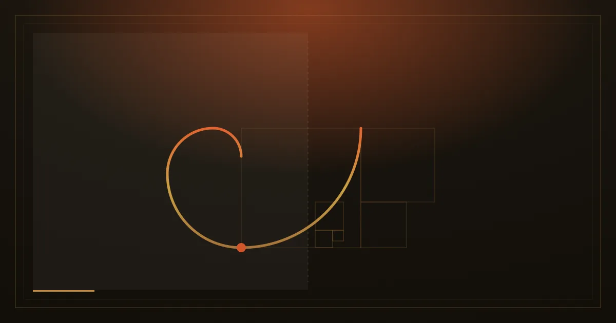 Beautiful gets judged usable. Legible comes first.
The aesthetic-usability effect: people forgive an attractive interface its flaws. We use that, on a hard floor of contrast and readability.
Beautiful gets judged usable. Legible comes first.
The aesthetic-usability effect: people forgive an attractive interface its flaws. We use that, on a hard floor of contrast and readability.
-
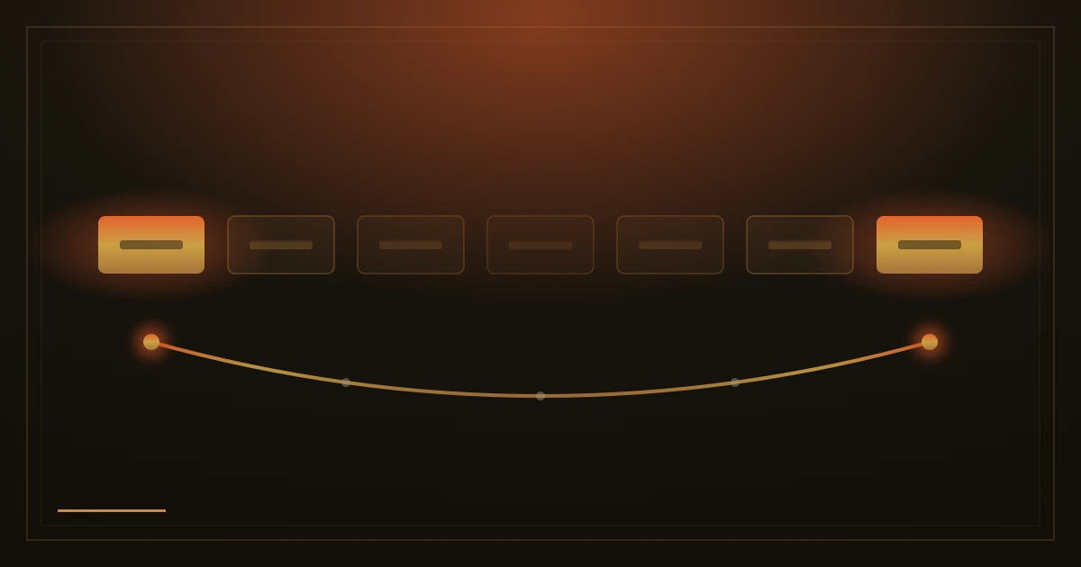 First and last: the menu positions people remember
The serial-position effect: people remember the beginning and the end of a list, while the middle fades. Why the order of your menu deserves a real decision.
First and last: the menu positions people remember
The serial-position effect: people remember the beginning and the end of a list, while the middle fades. Why the order of your menu deserves a real decision.