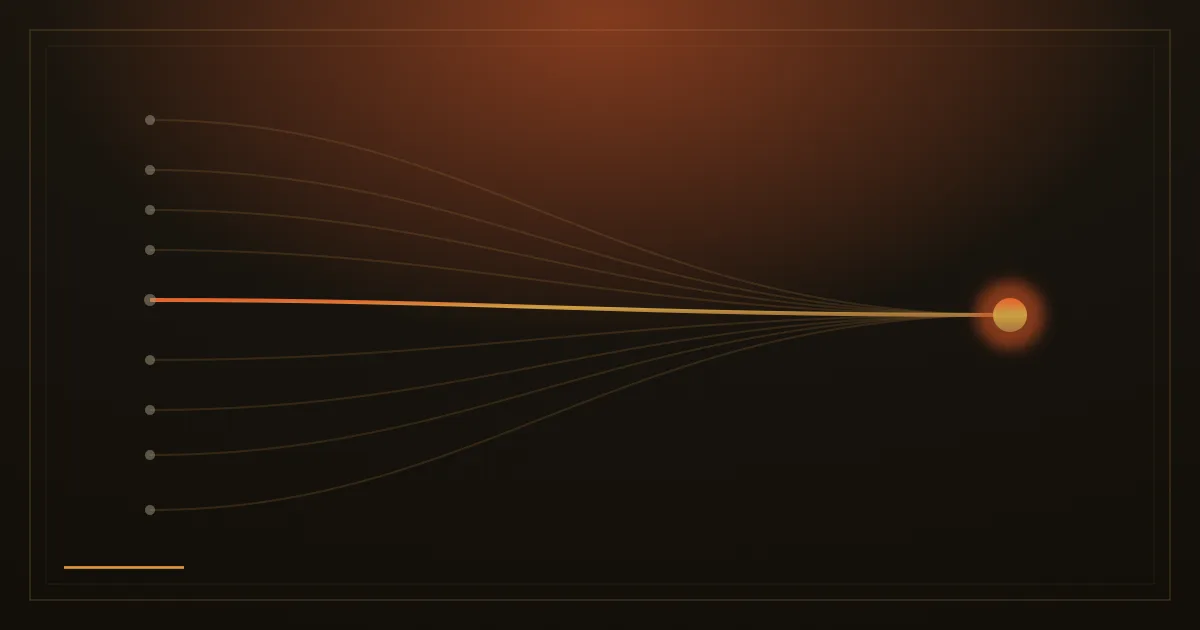
In 1952, two psychologists named William Hick and Ray Hyman ran a deceptively simple experiment. They presented people with varying numbers of stimuli and measured how long it took each person to respond to any given one. The result: decision time grew with the number of choices, but not in a straight line. The relationship was logarithmic. Doubling your options does not double the time to decide; it adds a fixed increment on top of what was already there. That finding, now called the Hick-Hyman Law, has shaped interface design ever since.
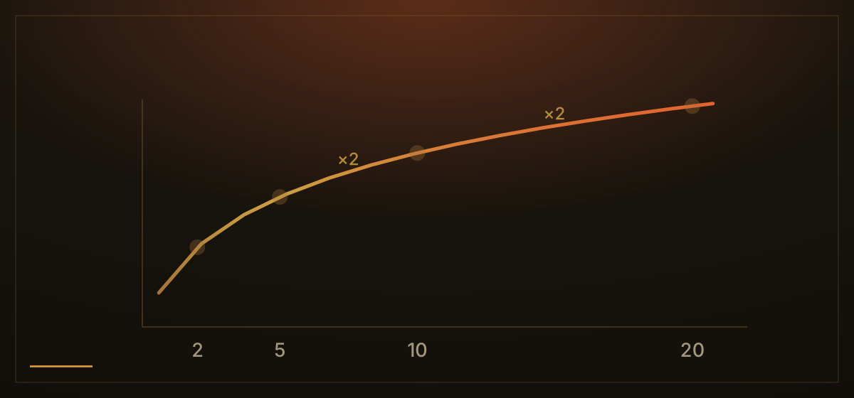
The practical reading for navigation is direct. Every item you add to a menu increases the time a visitor needs to orient, compare, and choose. That cost is real even when the options are clear and well-labelled. It is not that people cannot handle choices; it is that each choice requires cognitive work, and cognitive work has a price in both time and energy. A visitor who arrives with a specific intent still has to scan your seven-item navigation, decide which word most closely matches what they need, and discard the rest. Do that across every page they visit and the cost accumulates.
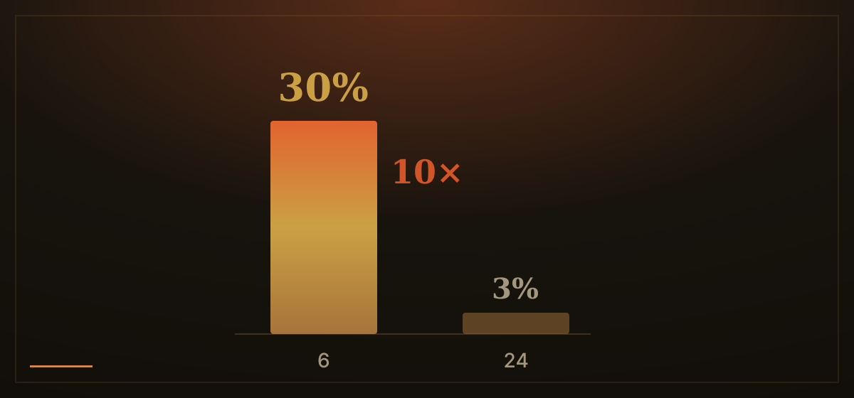
The jam study is probably the most cited piece of research in this area. In 2000, psychologists Sheena Iyengar and Mark Lepper set up tasting booths in a grocery store. One booth displayed twenty-four varieties of jam; the other displayed six. The larger display attracted more browsers: about 60% of shoppers stopped there, versus 40% at the smaller table. But of those who stopped at the twenty-four-jam table, only 3% made a purchase. At the six-jam table, 30% bought. Ten times the conversion rate from the smaller selection.
That study is real, published in the Journal of Personality and Social Psychology, and its numbers are widely cited. It is worth being accurate about its limits: a 2010 meta-analysis of fifty related studies found that the effect of larger choice sets on purchase rates averaged close to zero across the literature. The phenomenon is real, but conditional. It becomes a genuine problem when options are complex, when the person deciding is unfamiliar with the category, and when the decision feels effortful. That description fits, fairly precisely, a first-time visitor navigating an unfamiliar website.
One thing worth separating out: you may have heard that navigation menus should contain seven items, citing a psychologist named George Miller who identified the magical number seven, plus or minus two, as the limit of working memory. Miller's 1956 paper was about something specific: how many discrete, unrelated items a person can hold in short-term memory at once. It had nothing to do with reading a list of links. Miller himself later clarified that the finding applied to the discrimination of unidimensional stimuli, explicitly not to comprehending printed text. Nielsen Norman Group addressed this directly: the right number of items in a navigation menu is not seven. It depends on how distinct the options are, how they are grouped, and what the visitor is trying to do. Reach for Miller's number and you get a figure that feels scientific but points at the wrong thing entirely.
The sound case for shorter navigation does not need the misreading. Hick's Law is enough: fewer distinct options means faster orientation, a clearer path, and more cognitive energy left for the action you actually want visitors to take.
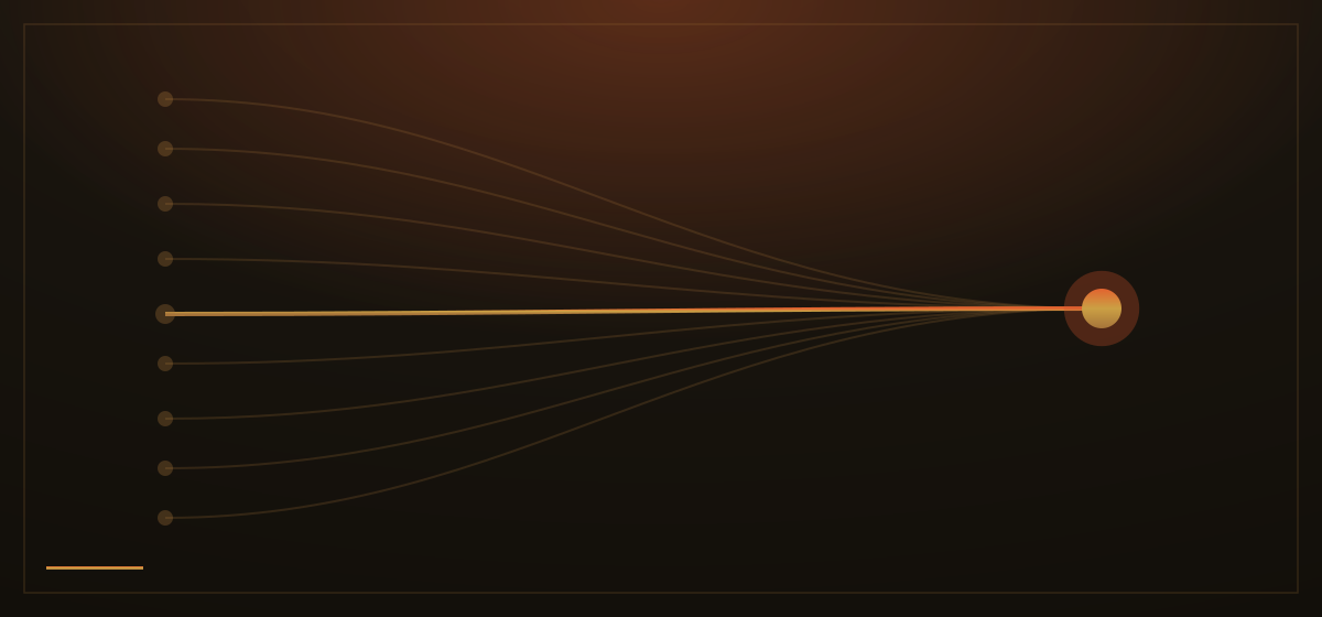
How we apply this: when we build a site, the navigation gets audited the same way every page does, by asking what to remove. We push back on requests to add menu items for every service, every sub-page, every blog category. If something belongs in the nav, something else probably belongs somewhere less prominent. The primary action on any page, a contact form, a quote request, a portfolio section, gets one clear route. What we have found, across many projects, is that visitors do not need more doors. They need the right door to be obvious.