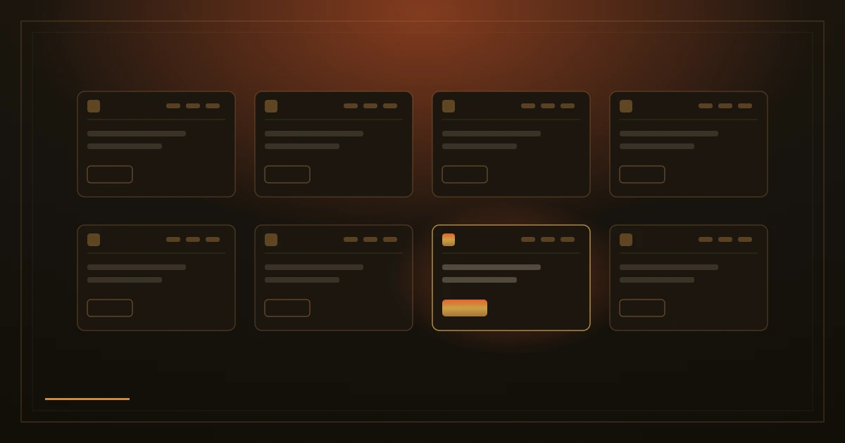
In 2000 the usability researcher Jakob Nielsen put a simple observation into words: people spend most of their time on other websites, not on yours. By the time someone reaches your site they have already used hundreds of others, and those others have taught them how a website is supposed to behave. They arrive with their expectations fully formed. The observation is now known as Jakob's Law, and it is one of the most practical ideas in web design.
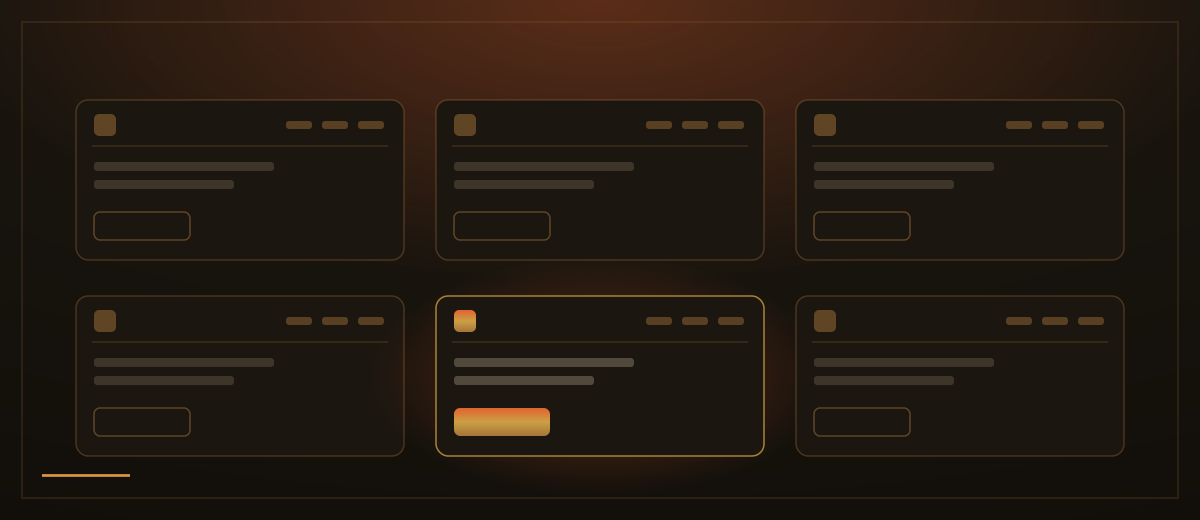
Researchers call the picture in a visitor's head a mental model. Nobody reads a manual before using a website; they lean on habit. The menu will be along the top. The logo in the corner will take them back to the start. The way to get in touch will sit at the end of the menu and at the bottom of the page. A form will look like a form, with boxes to type in and a clear button to send. Every site that follows these habits confirms the picture, and using it feels effortless.
Break the picture and the visitor has to stop and think. A menu hidden behind an unusual symbol, a contact page given a clever name, links that do not look like links: each one is a small puzzle. Nobody solves puzzles to book a table or a haircut. On the web the cost of confusion is one press of the back button, and the visitor lands on a competitor's site that works the way they expected.
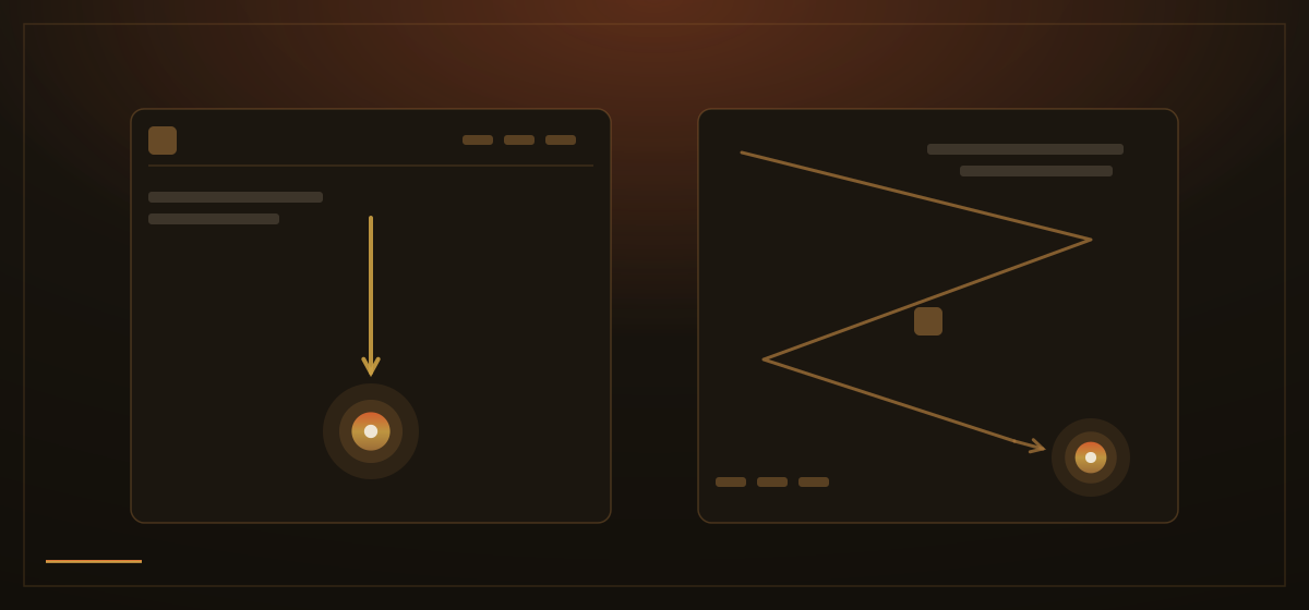
So the parts of a site that carry people around should follow convention without apology. Put the menu where menus go. Make the logo lead home. Keep the ways to reach you where everyone looks for them. Let buttons look pressable and fields look fillable. These pieces are the door handles of a website: nobody chooses a shop for its door handles, but everybody notices when a door will not open.
Being familiar in structure does not mean looking like everyone else. The places to be distinctive are the ones people actually remember: your colours and lettering, your photographs, the way you write, the work you show, the offer you make. Two shops can have identical door handles and completely different characters. Visitors want the layout they already know and a business they have not seen before.
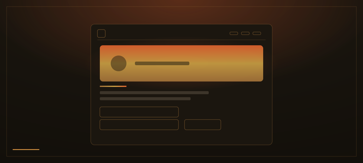
This is the quiet gift of convention: it frees attention. When the structure of a page needs no thought, the whole of the visitor's mind is available for what the page is actually saying. A distinctive site built on a familiar frame feels fresh and easy at the same time, which is exactly the impression a small business wants to leave.
How we apply this: we spend no creativity on navigation and all of it on character. Menus, contact details and forms sit exactly where habit expects them, and we let the identity carry the memory instead: the colour, the imagery, the words. Visitors should never notice the structure of a site we build. They should only notice the business.