
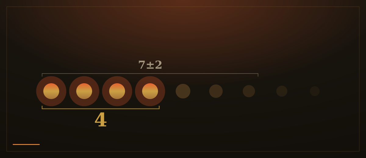
Human working memory is small. We can juggle only a handful of new things at once before something slips, and every extra choice, label and number on a screen draws from the same shallow pool. Educational psychologist John Sweller named the strain cognitive load: the mental effort a task demands. When a page asks for more than a person can comfortably hold, they do not work harder. They give up, guess, or leave.
Most of that load is self-inflicted. A form with thirty fields on one screen, a pricing page with nine columns, a menu with forty links, a paragraph that explains five features in one breath. Each was added in good faith, and each one adds to the pile the visitor must carry. The page feels thorough to the person who built it and exhausting to the person reading it.
The counter-move is progressive disclosure: show the few things most people need right now, and keep the rest one deliberate step away. Jakob Nielsen has long argued that this is one of the most effective ways to manage complexity without amputating it. The advanced settings still exist, behind a clearly labelled control. The full specification is still there, under a heading you can open. The fifteenth field appears only once the first answer makes it relevant. Nothing is removed; it is simply staged.

Done well, this is invisible. A good page feels like it is reading the visitor's mind, offering the next thing at the moment they reach for it. That feeling is not magic. It is restraint: someone decided what belonged on the first screen and trusted that the rest could wait. The decision is the hard part, because every option left out is an argument with whoever wanted it in.
Staging also respects the order in which people actually think. Nobody chooses a plan before they understand what the service does, or fills in payment before they trust the offer. A page that front-loads the hard, high-commitment asks is fighting the visitor's natural sequence. A page that answers the obvious questions first, then reveals the detail as interest grows, moves with them.
There is a quieter benefit too. When a screen holds only what matters now, the things on it get their share of attention. Cut a page from twenty elements to six and each of the six is read, not skimmed past. Less on the page is not less information delivered; it is often more, because more of it actually lands.
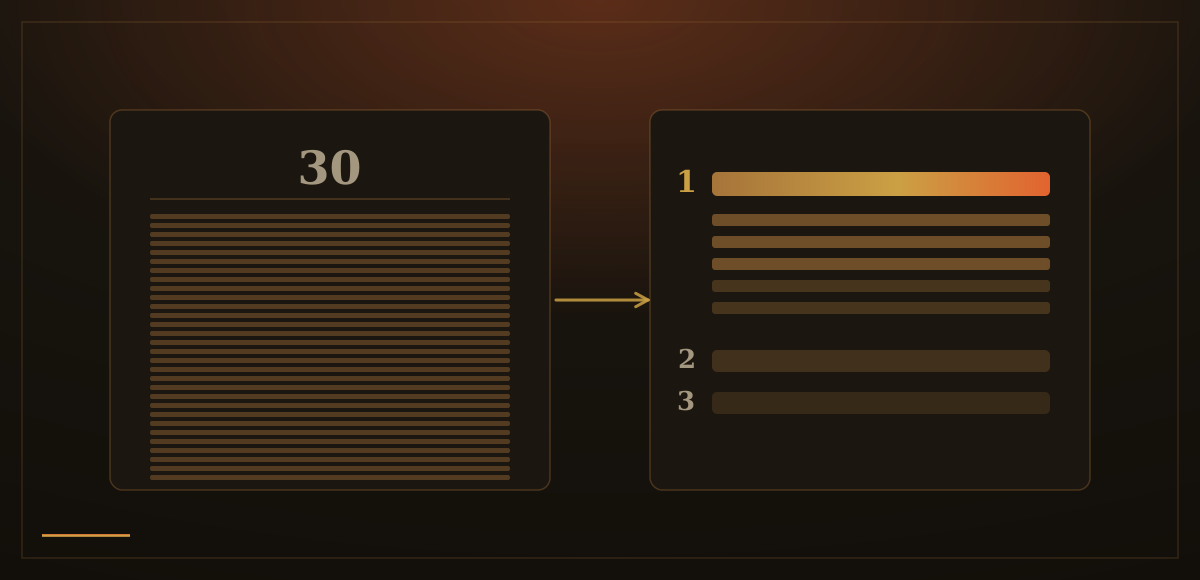
How we apply this: we design the first screen of every page around the one question a visitor is really asking, and we let the depth unfold from there: sections that open, detail that waits, forms that grow only as far as the answer requires. The goal is a page a tired person on a phone can follow without effort, because we did the work of deciding what comes first so they don't have to.