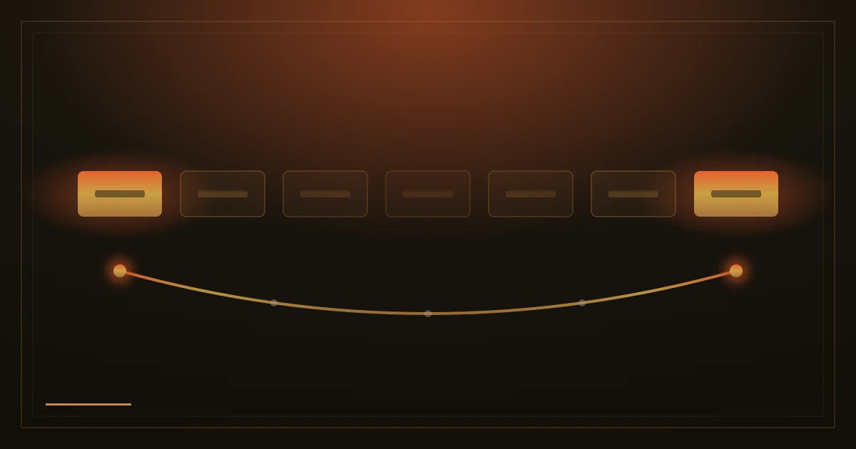
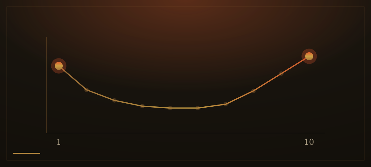
In the 1880s the German psychologist Hermann Ebbinghaus taught himself long lists of made-up syllables and measured, with great patience, what he could still recall. The items at the beginning and the end of each list came back most easily; the middle faded first. In 1962 Bennet Murdock confirmed the shape of this in the laboratory: he read people lists of words, asked them to repeat back whatever they remembered in any order, and the results drew the same curve every time. Strong at the start, strong at the finish, a dip in between. Psychologists call it the serial-position effect.
A website menu is a list. So is a row of services, a set of bullet points, a table of prices read left to right. Visitors do not study these; they skim them once, form an impression, and move on. What the skim leaves behind follows the old curve: the first item registers because attention is fresh, the last item registers because nothing comes after it to overwrite it, and the middle blurs together.
Most menus are not built with this in mind. They grow by history: the page that existed first sits first, and each new page is bolted onto the end or squeezed into the middle. Or they are ordered alphabetically, which feels tidy and fair but hands the best positions to whatever happens to start with an early letter. Either way, the two most valuable slots on the whole site are given away by accident.

The fix is to order deliberately. Put the thing visitors most need to find in the first position, right after home. Put the action you most want them to take, usually contact, in the last position, where the eye comes to rest and the memory holds on. Whatever sits between them should be there because it earns its place, not because it was there before.
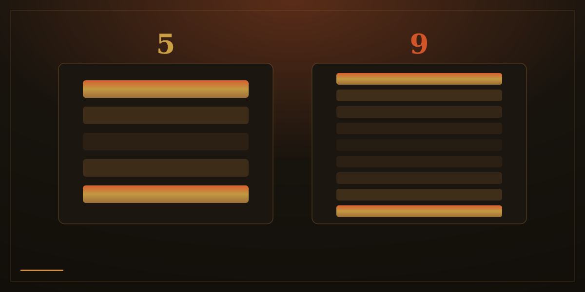
Then keep the list short. A menu of five items has a middle of three; a menu of nine has a middle of seven, and the middle is exactly where things go to be forgotten. Every item you add does not just take its own space; it pushes something else deeper into the blur. Cutting a menu from nine entries to five is not a loss of content. It is a promotion for everything that stays.
The same rule shapes the smaller lists. In a list of services, lead with your strongest offer and close with your second strongest; the weakest belongs in the middle, where its weakness shows least. In a set of bullet points, the first and last lines are the ones people quote back later. Deciding those two lines last, once you know what matters most, is worth the extra minute.
None of this is a trick, and it will not rescue a confusing label or a page nobody wants. Position decides what gets noticed and remembered first; only clarity decides what happens next. The effect simply means that order is a real design decision, and it is made either by you or by accident.
How we apply this: when we plan a site's navigation, we decide the first and the last menu item before anything else, and we weigh the order of every list on the page as carefully as others weigh colours. Menus stay short enough that there is barely a middle, and the thing a client sells best is never left to sink in one.