Fitts's Law is a piece of human-factors research from 1954, and it remains one of the most accurately verified principles in psychology. Paul Fitts studied how long it takes people to move a pointer to a target and found that the time is predictable from two variables: the distance to the target and its size. The bigger and closer the target, the faster and more accurately you reach it. The smaller and farther away it is, the more time you waste and the more errors you make.
On a desktop computer this matters less. A mouse covers distance with a wrist movement and lands with pixel precision. On a touchscreen phone, your pointing device is a thumb. The MIT Touch Lab puts average fingertip width at 8 to 10 millimeters, and the thumb pad at roughly 25 millimeters. That is not a point; it is a contact patch. And unlike a mouse cursor, a thumb has to travel across real physical distance on the glass before it gets there.
This is why every major platform has a minimum tap target recommendation, and why they agree more than people realize. Apple's Human Interface Guidelines have specified 44 by 44 points as the minimum tappable area since the first iPhone launched in 2007. Material Design, Google's design system for Android, recommends 48 by 48 density-independent pixels with 8 pixels of spacing between adjacent targets. WCAG 2.5.8, a new Level AA requirement in version 2.2 of the Web Content Accessibility Guidelines, sets a legal minimum of 24 by 24 CSS pixels, or enough clear space around each control that a mis-tap hits nothing.
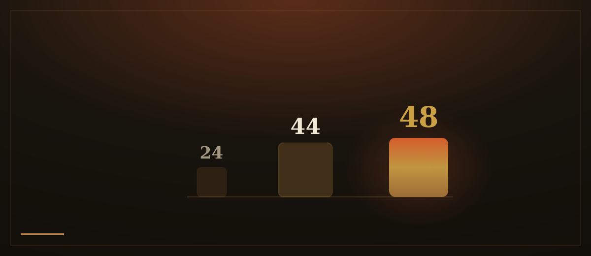
These numbers are not arbitrary comfort margins. Research on error rates shows that targets below roughly 7 millimeters push mis-tap rates up steeply, while targets in the 9 to 10 millimeter range keep them low. On a modern iPhone, a 44-point target measures about 7 millimeters, which places it right at the bottom edge of the error-rate curve. That is why the Apple specification is a floor, not a recommendation to aim for.
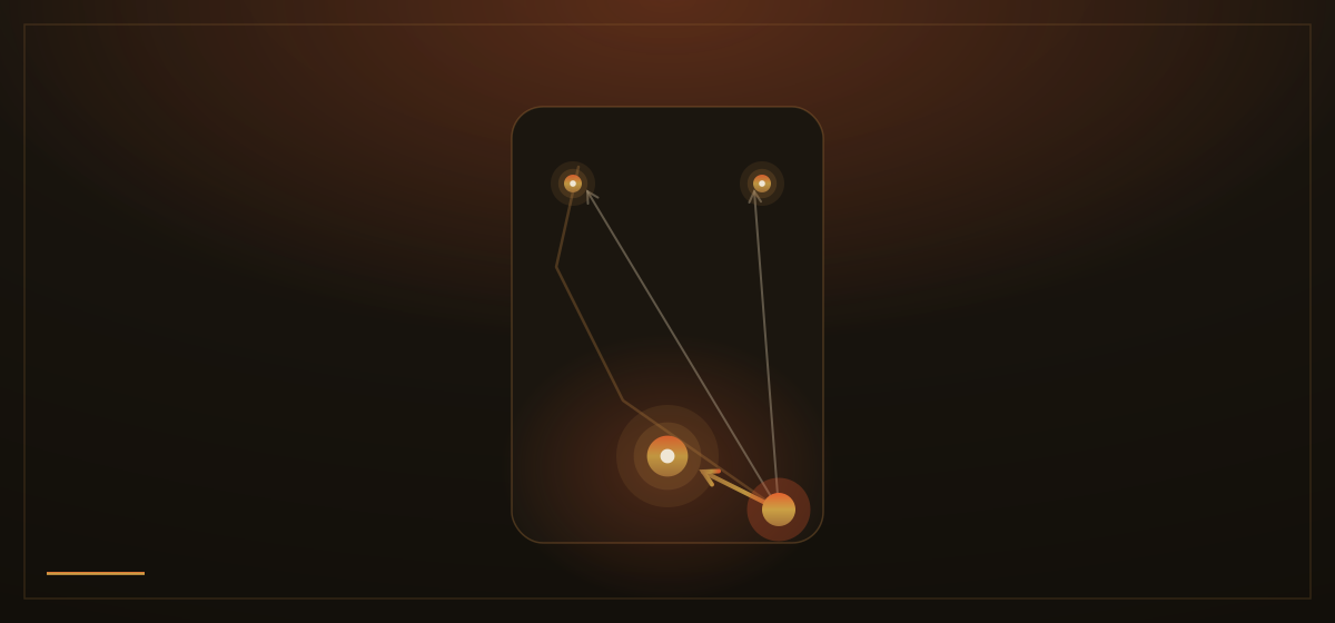
There is also a location problem that Fitts's Law makes precise: distance matters as much as size. Steven Hoober's research on how people actually hold and use their phones found that comfortable one-handed thumb reach traces a curved arc toward the center of the screen. Corners, especially the top corners, are the hardest regions to reach. The bottom center is the easiest. Place your most important action where the thumb naturally rests and you have reduced the distance component of the equation without changing the button at all.
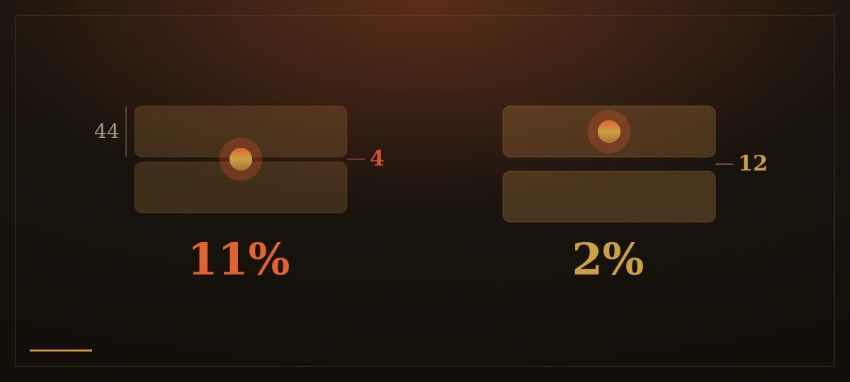
A real-world example makes this concrete. A design team tracking mis-tap data found two buttons, each 44 points tall but only 4 points apart, producing an 11 percent mis-tap rate. They did not enlarge the buttons. They increased the gap to 12 points. The mis-tap rate fell from 11 percent to 2 percent. Spacing, not size, was the dominant factor.
How we apply this: every interactive element we build starts at 44 by 44 points as an absolute minimum, typically 48 CSS pixels to align with Material's recommendation and give a small margin above the error-rate floor. We give vertically stacked controls at least 8 pixels of clear space between them. Primary actions, contact, call, request a quote, go in the lower-center zone where a thumb naturally lands, not tucked into a corner or hidden at the top. On a phone, a button that is hard to tap is a broken button, and we treat tap-target discipline as exactly the same discipline as load-time discipline: unnecessary friction, removed.