Someone types a phone number into a form, with the spaces they always use between the digits. The page turns red: invalid number. They fix it, submit again, and are refused because their email has a capital letter in it. On the third try the page reloads and everything they wrote is gone. Most people blame themselves at that moment, and they are wrong to. When a person and a form disagree, the form is almost always the one at fault.
In The Design of Everyday Things (1988), Don Norman separated human error into two kinds. A slip is when you know exactly what you mean to do but your hand does something else: a mistyped digit, a tap on the wrong box. A mistake is when you understood the task differently than the designer did. Both are ordinary, both are predictable, and Norman's conclusion has guided good design ever since: expect errors, shape things so they are hard to commit, and make them easy to recover from when they happen anyway. Blaming the user is just the designer giving up.
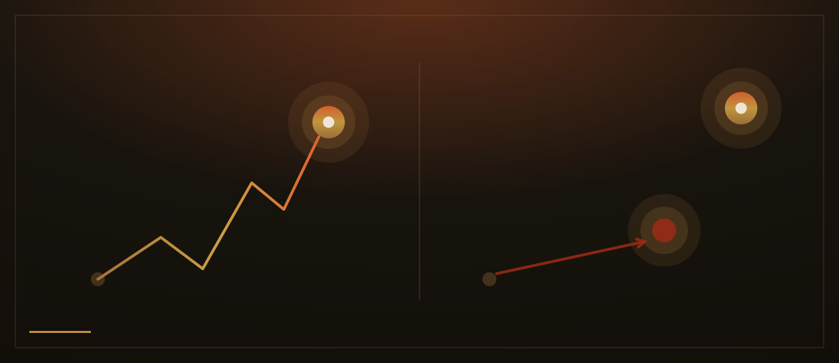
The cost of ignoring this is not theoretical. The Baymard Institute has spent years testing checkout forms on large shopping sites, watching real people try to pay. The same two problems return in study after study: forms ask for more than they need, and they reject input for reasons the customer cannot see. In Baymard's large-scale research on abandoned purchases, a meaningful share of the people who gave up point to a checkout that was too long or too complicated. These were customers holding their card. The form talked them out of it.
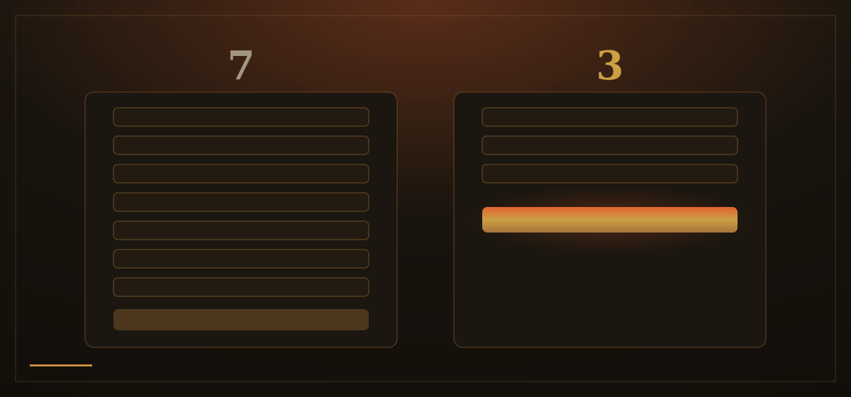
The first act of forgiveness is to ask less. Every field is a small toll, a moment where the visitor decides whether this is still worth it. A field you do not truly need, a company name, a fax number, a second address line made compulsory, is a place someone can fail for no reason at all. If the answer will not change what happens next, do not ask the question.
The second is to accept the way people actually write. Humans put spaces in phone numbers, capital letters in email addresses, a stray space after their name. None of that is wrong; it is how the same information looks in human hands. Software can remove a space or lower a letter in an instant, so it should, quietly. A form that rejects 99 123456 but accepts 99123456 is not being precise. It is passing its own tidying work to the customer.
The third is to fail gently when something genuinely needs fixing. Point the problem out next to the field it concerns, in plain words, while the person is still there and can still act. Say what to do, not just that something is wrong: telling someone the card number looks one digit short helps far more than a bare invalid input. And never, under any circumstances, wipe what someone has already typed. A form that empties itself punishes the visitor for its own confusion, and few people are patient enough to be punished twice.
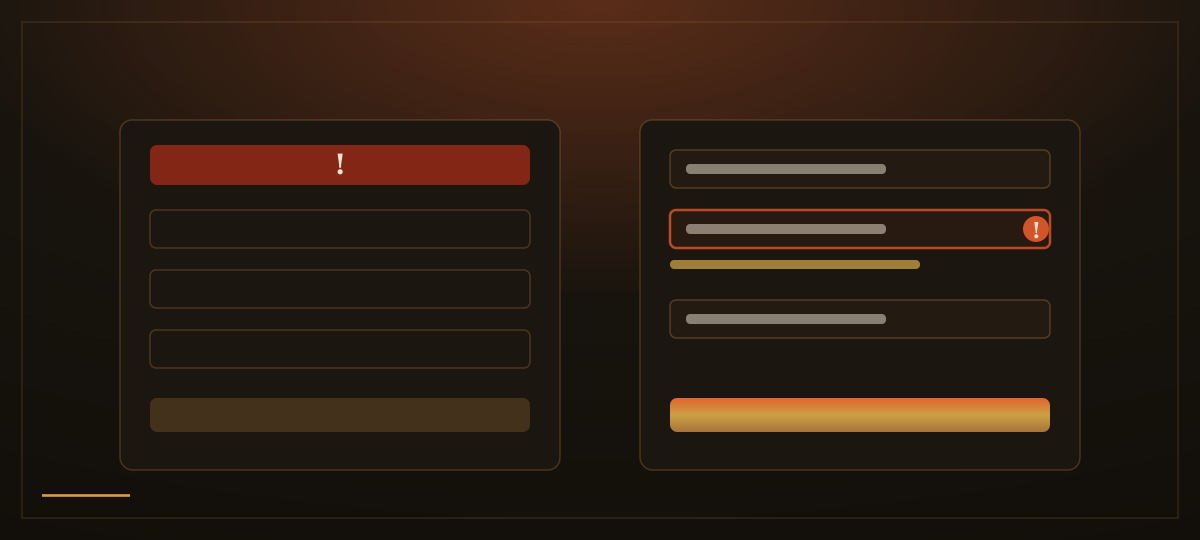
How we apply this: every form we build asks the minimum, and we argue over every field before it earns its place. Phone numbers, emails and names are tidied by the software, never bounced back over spacing or letter case. Problems are pointed out beside the field, in the visitor's language, with the fix spelled out, and nothing a person has typed is ever thrown away. A form is often the last step between a visitor and a customer. It should behave like a door, not a test.