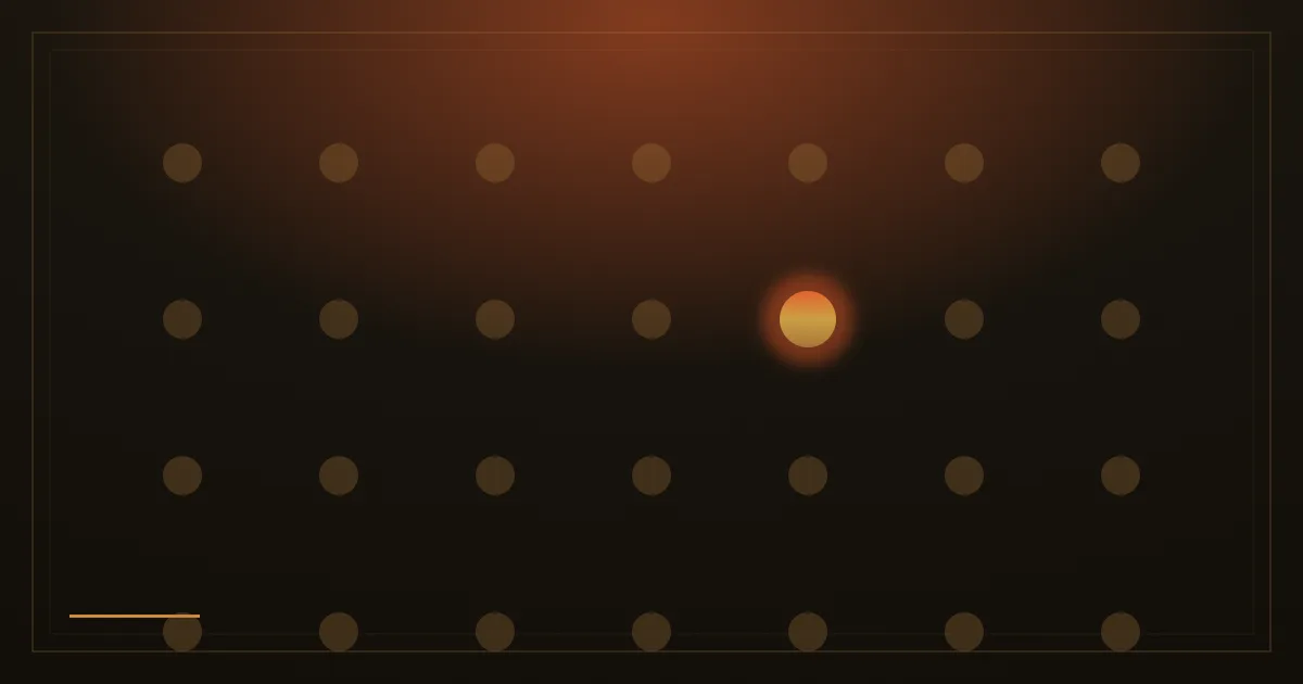
In 1933 the psychiatrist Hedwig von Restorff ran a quiet little memory experiment. She gave people a list in which one item was made to look different from the rest, and that item was the one they remembered. The finding has held up for ninety years and now carries her name: the isolation effect. The thing that stands out gets seen, and gets recalled.
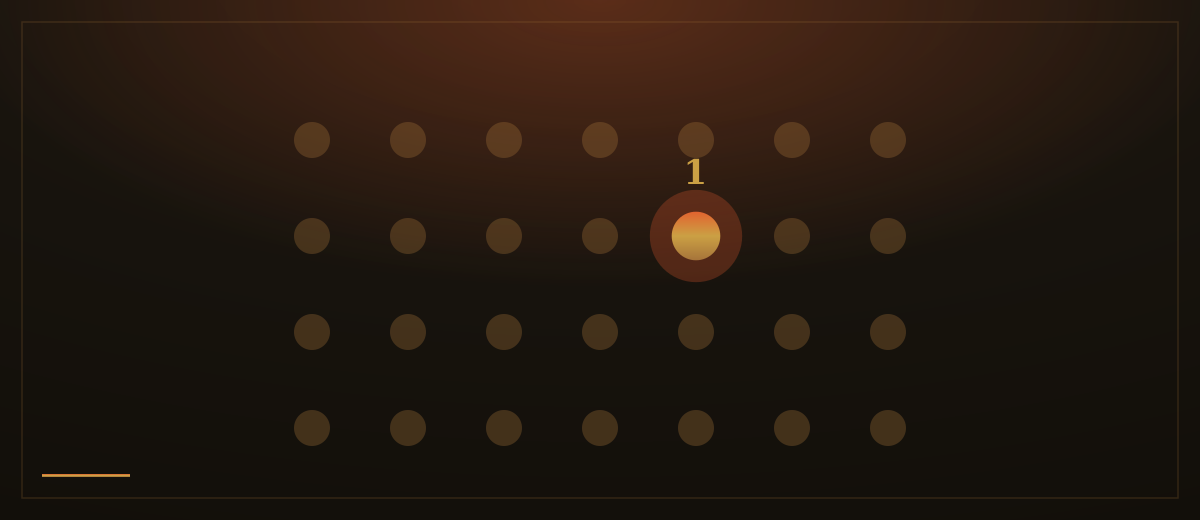
Most websites are the opposite of that experiment. Every part of the page is fighting for the same attention. Three buttons, all the same size and colour. A banner at the top, a chat bubble in the corner, a newsletter bar at the bottom, a popup over the lot. Each one was added by someone who wanted their thing noticed. Added together, they cancel out. When everything is emphasised, nothing is, because the eye has no anchor and gives up choosing.
The fix is not to shout louder. It is to let one thing be loud and make everything else step back. A page should have a single obvious next step, the one action you most want a visitor to take, and that step should be the brightest, highest-contrast thing in view. Everything that competes with it should be quieted: secondary links rendered as plain text, supporting buttons drawn as outlines, decoration dimmed until it supports rather than distracts.
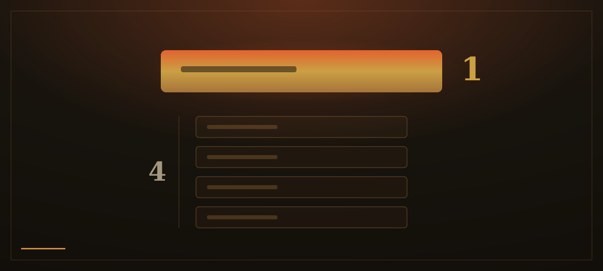
This is harder than it sounds, because it means choosing. If the home page asks people to call, book, buy and subscribe with equal weight, it has really asked them to do nothing. Picking the one action is a business decision before it is a design one. Once it is made, the design becomes simple: make that action unmistakable, and give it room to breathe so nothing crowds it.
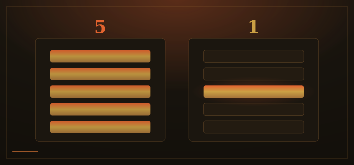
Contrast is what does the work. The standout element earns its attention by differing from its surroundings in colour, size or space, not by being big in isolation. A single warm button on a calm page pulls the eye far harder than five bright buttons in a row, because difference, not volume, is what the brain is tuned to detect. The same logic governs a key statistic, a single testimonial, one photograph: surround it with quiet and it carries weight; pile more around it and it sinks into the noise.
There is a discipline cost to this. Saying that one thing matters most means saying the others matter less, and someone always wants their banner back. But a page that respects the visitor's attention spends it on their behalf, pointing clearly at the thing worth doing instead of leaving them to referee a shouting match.
How we apply this: every page we build has one primary action and only one. It is the single glowing element on the page; the rest, however useful, is drawn quietly around it. We would rather a visitor leave knowing exactly what we wanted them to do than admire a screen where ten things all demanded to be first.