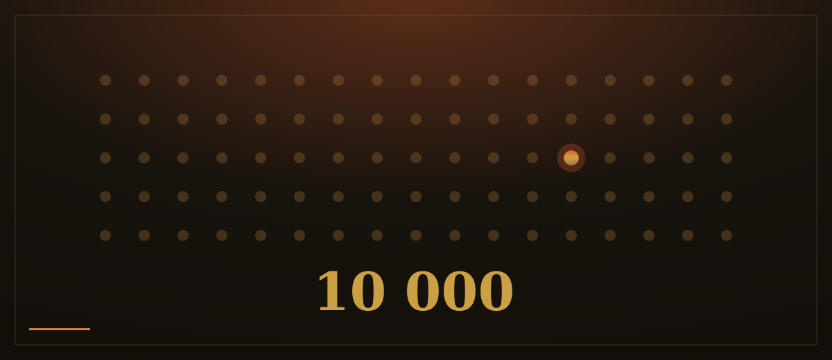
In 1973 the psychologist Lionel Standing ran a memory experiment on an almost absurd scale. Across several sessions he showed volunteers up to ten thousand photographs, each appearing only once, for about five seconds. Two days later he showed them pairs of pictures, one they had seen and one they had not, and asked which was familiar. They picked the seen picture with striking accuracy, thousands of times over. Human memory, it turns out, is remarkably good at one particular job: recognizing what is in front of it.
Now imagine asking those same volunteers to sit down and list the pictures from memory. Most would manage a few dozen at best. The gap between recognizing something you can see and recalling something from nothing is one of the steadiest findings in memory research. In 1994 the usability researcher Jakob Nielsen turned it into a rule for screens: recognition rather than recall. A good page shows people their options and lets them recognize the right one. A poor page expects them to remember.
Bare icons are the most common way this rule gets broken. A gear, a heart, three stacked lines, a shape that made perfect sense to whoever drew it. Every icon without a word beside it is a small memory test: the visitor must recall what that shape meant on some other site, at some other time. Some pass. Some quietly fail and leave. A plain word next to each icon costs a little space and removes the test entirely. Clear menus with real words beat clever symbols every single day.
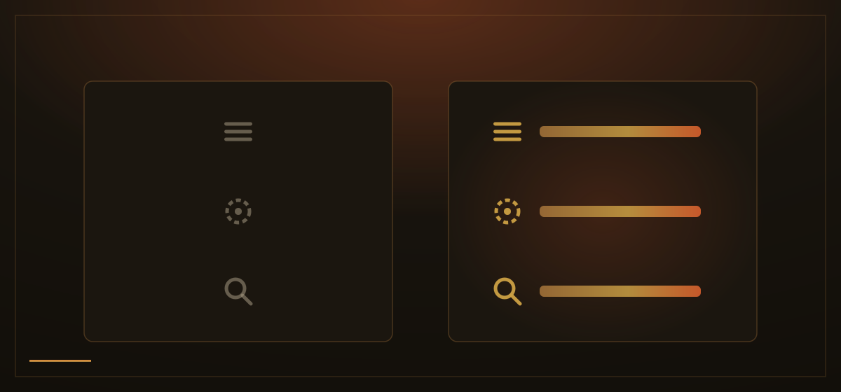
The same rule applies wherever people make a choice. A box that asks visitors to type a service name, a code or an option from memory is a recall task, and recall is where people stall and make mistakes. Visible, labeled choices they can simply tap turn the same decision into recognition. Nobody has to remember what the options were called; the options introduce themselves.
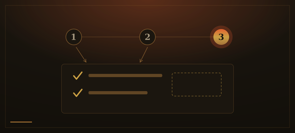
It matters most in tasks with several steps. Booking an appointment, placing an order, requesting a quote: by step three, whatever was chosen in steps one and two should still be visible on the page. The date picked, the items selected, which step this is and how many remain. If the page hides all that, the visitor has to carry it in their head, and heads are exactly where this kind of detail falls out. Keeping earlier answers in view is not decoration; it is the page doing the remembering.
Showing recently viewed items is the same principle stretched across visits. A returning visitor rarely remembers what a product or page was called, but they recognize it instantly when they see it again. A short row of the things they looked at last time takes them straight back to where they left off, with no searching and no guessing.
How we apply this: we treat every screen we build as a place where the visitor should recognize, not remember. Menus use words, not bare symbols. Forms offer choices to tap rather than names to type. Pages with several steps keep every earlier choice visible until the end. The site carries the memory, so the visitor only has to carry the decision.