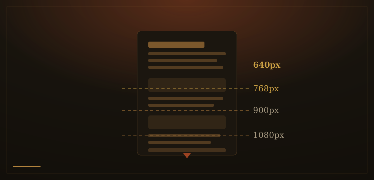
For years, the advice was absolute: put everything important above the fold. The fold, that invisible line where a page is cut off on first load before anyone scrolls, was treated as a wall. Anything below it might as well not exist. This belief came from the early web, when scrolling was genuinely unusual and many users did not attempt it. It stuck around long after user behavior changed.
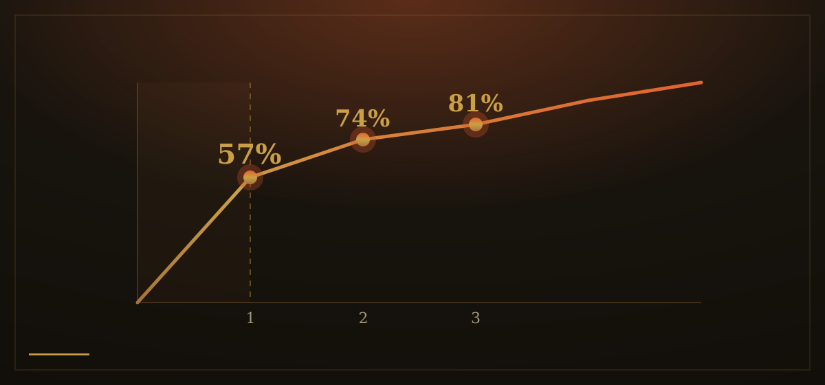
The data is clear on this. A 2018 Nielsen Norman Group study measuring over 130,000 eye fixations across 120 participants found that users spent 57 percent of their page-viewing time above the fold, down from 80 percent in an earlier 2010 study. The drop is significant. Scrolling has become routine. Separate research from Chartbeat, drawing on data from over two billion web visits, found that 66 percent of visits involved scrolling below the fold. People scroll. Anyone still designing as if the fold is a wall is building for a web that no longer exists.
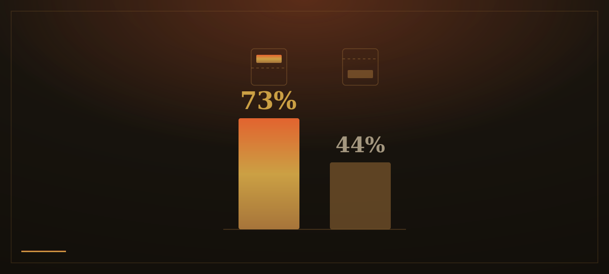
Here is the nuance the "fold is dead" argument tends to skip: attention still concentrates near the top, and the gradient is steep. The same Nielsen Norman Group study found that 74 percent of viewing time fell within the first two screenfuls, and 81 percent within the first three. Content positioned 100 pixels above the fold receives 102 percent more views than content 100 pixels below it. Ad placement data from Google shows that ads just above the fold achieve 73 percent viewability, while ads just below achieve only 44 percent, a difference of nearly two to one, caused by a handful of pixels.
Nielsen Norman Group's research describes the underlying mechanic clearly: users scroll when motivated by what they can see. The content above the fold is not a container. It is an invitation. If it is compelling, visitors continue. If it is vague, cluttered, or fails to answer the basic question of why they should stay, they leave. A particular hazard is what researchers call a false floor: a design that appears complete at first glance, with no visible indication that more content follows. The page looks finished, so the visitor assumes it is.
The wrong response to this research is to cram everything important into the first screen. A hero section packed with five headlines, bullet points, two calls to action, and a feature grid does not solve the problem. It creates a different one. Visual competition. The eye has nowhere to land. Nothing earns priority. A page that cannot communicate its single most important idea in the first screenful will not communicate it at all, regardless of how many words it contains.
We do not design for the fold. We design for the invitation.
Above the fold, we place one clear headline, one supporting line, and one action. The design creates breathing room, whitespace that focuses the eye rather than distributing it. A visual cue at the bottom of the screen, a partial element or a gentle signal, indicates that the page continues. Below the fold, the page deepens: evidence, context, specifics. The structure is deliberate. The top makes a claim. Everything below it makes the case.
The scroll is not a problem to solve. It is a reward the page must earn.