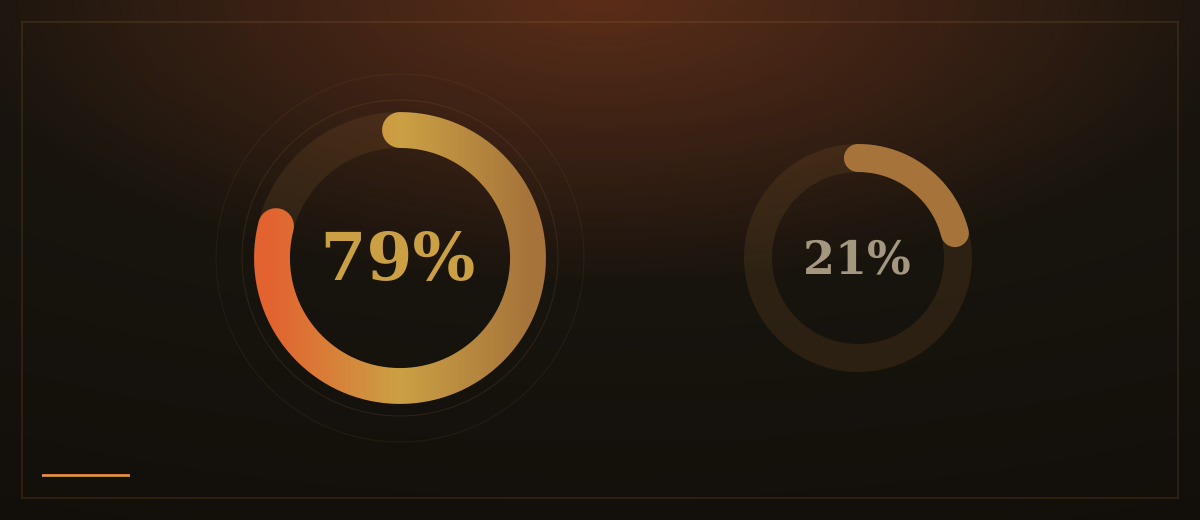
In 1997, Jakob Nielsen published a finding that still holds: 79 percent of people who visit a web page scan it rather than read it word by word. That number has only grown more true as phones became our primary reading devices and attention shortened. People are not lazy. They are efficient. A scan delivers almost the same information as a full read, in a fraction of the time. Design that ignores this is fighting the user.
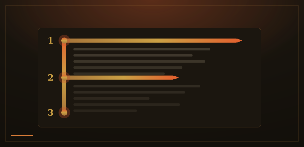
Starting in 2006, researchers at Nielsen Norman Group conducted eye-tracking studies measuring where people actually look on web pages. In text-heavy layouts, the eye moves in a predictable shape: a strong horizontal sweep across the top of the content, a shorter horizontal sweep a bit lower, then a vertical scan down the left edge. It forms an F. A follow-up study eleven years later, in 2017, confirmed the pattern was unchanged, across desktop and mobile alike.
The F-pattern is not a curiosity. It is a signal. It tells you that first lines get read, the left edge gets read, and the right side of your page largely gets ignored. Long paragraphs lose readers before they end. Every line start competes for attention; the rest of each line does not. If your message sits in the middle of a paragraph, most visitors never reach it.
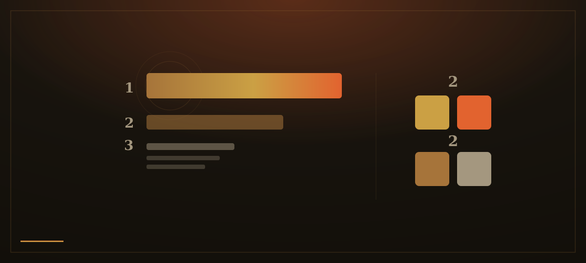
The F-pattern is what happens when a page offers the eye no structure to follow. The same researchers identified a better scanning behavior: the layer-cake pattern. When headings and subheadings are visually distinct (larger, bolder, clearly different from body text) the eye hops from heading to heading, reads the ones that seem relevant, then drops into the body text underneath. This is efficient. Good design steers the scan instead of surrendering to it.
Visual hierarchy is the set of cues that tell the eye where to look first. Size is the most direct: a large heading commands attention before a small one. Contrast works the same way: a high-contrast element pulls the gaze before a low-contrast one. Whitespace is less obvious but equally powerful. Elements surrounded by space receive more attention because nothing else competes for the eye in that area. When everything is crowded, nothing reads as important. Nielsen Norman Group's research on visual hierarchy recommends keeping the type scale simple (three sizes at most) and color limited to two primary values and two secondary ones. The more variety you add, the harder the eye works to build a hierarchy from the noise.
A related model, the Z-pattern, is useful for pages with little text: a hero section, a landing page, a campaign. On a sparse layout, the eye starts at the top left, sweeps right, drops diagonally to the bottom left, then sweeps right again toward the call to action. It describes where to place the most important elements in a visually led layout, more a design intention than a rigorously measured behavior, but a reliable framework for low-density pages.
When we lay out a hero section, we think through this sequence deliberately. The headline carries enough size and contrast to anchor the eye immediately. The supporting text is shorter than it wants to be. Whitespace is not wasted space. It is the signal that tells the eye something here deserves attention. The call to action sits at the natural next stop in the gaze path. Nothing on the page competes for the eye unless it has earned that competition.
We do not fill every gap. We do not animate every element. We ask: if a visitor spends six seconds on this page, what should they have seen? Then we design the path to that answer.